10 Clever Packaging Mind Games That Push You to Overbuy Your Groceries Every Time
Those flashy grocery store packages aren’t just pretty designs – they’re carefully crafted to make you spend more money. From oversized boxes that look like better deals to clever multi-pack arrangements, manufacturers use proven psychological tricks to influence your shopping decisions.
I’ve spent years investigating how food companies persuade shoppers to fill their carts with more than they planned. The tactics go beyond simple marketing – they tap into human psychology and behavioral science to trigger impulse purchases and create perceived value where there might not be any.
Understanding these packaging mind games will help you become a smarter shopper and save money on groceries. By recognizing the subtle ways companies influence your choices, you can make more intentional decisions at the store and stick to your shopping list. Here are 10 clever tactics to watch out for.
Packaging Shape that Implies Innovation

You’ll notice how many brands create unique, asymmetrical packaging shapes to make their products stand out on shelves. Take dish soap bottles – they used to be simple cylinders, but now you’ll find them with curved necks, ergonomic grips, and fancy geometric patterns. These eye-catching designs trigger your brain to associate the unusual shape with advancement and improvement, making you think “this must be better than the basic version.” Companies know that if they can convince you their product looks more advanced, you’re more likely to pick it over simpler-looking competitors.
The psychology goes deeper than just looking different. When you see an oddly-shaped package, your brain automatically assumes there must be a functional reason behind the design – even if there isn’t one. That sleek, twisted bottle of olive oil? The unusual shape probably doesn’t make it pour any better, but it creates an impression of thoughtful engineering and premium quality. This clever visual trick leads many shoppers to pay more for essentially the same product, simply because the package shape signals innovation and superiority. Next time you shop, notice how many “innovative” package shapes catch your eye!
Use of Emotive Colors to Stimulate Appetite

Ever noticed how your favorite food brands use specific colors to catch your eye? Red and yellow dominate fast-food logos and packaging because these warm colors can make you hungry! Think about those bright yellow chips bags or the bold red soda cans – they’re not random choices. Food companies know these colors trigger your brain to feel hungry and excited about eating. The psychology behind this marketing trick goes deep into how your brain processes different colors and connects them to food memories and cravings.
Next time you walk down the grocery store aisles, look at how many products use red, yellow, and orange in their packaging. These colors remind you of ripe fruits, warm meals, and comfort foods. Blue and purple rarely appear on food packaging since they don’t naturally occur in many foods – except berries and some vegetables. Companies deliberately pick these appetite-boosting colors to make their products more appealing, hoping you’ll grab an extra bag or two. Understanding this trick can help you make more conscious shopping decisions based on what you need rather than what the packaging wants you to feel.
Perceived Value through Price Anchoring
I noticed this clever marketing trick at my local grocery store last week – they placed a premium organic coffee brand right next to their basic house blend. The expensive one was $24.99 while the regular option cost $12.99. This price anchoring makes the cheaper coffee look like an amazing deal, even though it’s still marked up significantly. Your brain automatically uses the higher price as a reference point, making you more likely to grab what seems like a “bargain” without questioning if you really need it.
You’ll spot this strategy everywhere in the supermarket aisles. Think about those fancy imported olive oils displayed next to standard cooking oils, or premium ice cream brands sharing shelf space with budget varieties. The stores deliberately create these price comparisons to influence your perception of value. Next time you shop, watch out for these strategic product placements and ask yourself if you’re buying something just because it looks cheaper in comparison. Your wallet will thank you for being aware of this subtle but powerful pricing psychology!
Employing Limited Edition Branding
You’ve probably noticed those eye-catching “limited edition” labels on your favorite snacks and drinks at the grocery store. Companies know exactly how to trigger your FOMO (fear of missing out) with seasonal flavors and special packaging that make you want to grab multiple items right away. From pumpkin spice everything in fall to exclusive summer berry blends, these temporary offerings create a sense of urgency that can push you to buy more than you need. I see so many shoppers filling their carts with these special items, worried they’ll miss out if they don’t stock up now.
The psychology behind limited editions is pretty clever – they combine scarcity with exclusivity to make regular products feel more valuable and desirable. Think about those special holiday M&M’s colors or the unique Oreo flavors that only stick around for a few weeks. You might find yourself buying several packages “just in case,” even though you wouldn’t normally purchase so many. Companies carefully time these releases to coincide with holidays, seasons, or special events, creating a continuous cycle of must-have products that keep you coming back for more throughout the year.
Clever Use of Recyclable and Eco-Friendly Claims

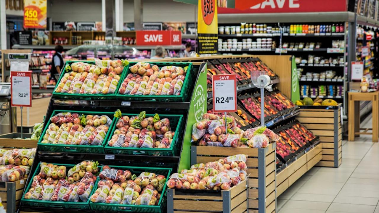
Those “eco-friendly” and “100% recyclable” labels on your grocery items might make you feel good about your purchases, but they often hide a sneaky marketing trick. Many brands splash these green claims prominently on their packaging while using more materials than necessary. Think about that box of cereal with the “recyclable” banner – it probably has an outer box, inner plastic bag, and maybe even individual portion bags inside. The environmental messaging distracts you from noticing how much packaging you’re actually buying and makes you more likely to choose that product over simpler alternatives.
I’ve noticed this clever tactic more and more in my local grocery store. Even basic items like apples now come in “eco-friendly” plastic containers instead of being sold loose. The marketing teams know that environmentally conscious shoppers will gravitate toward these products despite the excess packaging. Next time you shop, look beyond the green messaging and ask yourself if you really need all those layers of “recyclable” materials. You might find that the most environmentally friendly choice is the product with minimal packaging, regardless of what the eco-labels claim.
Visually Deceptive Font and Imagery

You’ve probably noticed those fancy fonts and eye-catching images on food packages that make products look bigger or more appealing than they really are. Companies often use oversized text or strategically placed graphics to draw your attention away from the actual size information. For example, a cereal box might display a massive “30% MORE!” in bold letters, while the fine print reveals it’s just compared to a smaller size that’s no longer available. The images on packages frequently show heaping portions or idealized versions that don’t match the real contents inside.
These visual tricks go beyond just making products look prettier – they’re carefully designed to influence your buying decisions. Next time you shop, look at how packages use shadows, color gradients, and cleverly positioned product photos to create illusions of abundance. A bag of chips might show perfectly whole, crispy specimens spilling out of a bowl, when reality gives you plenty of broken pieces. Or a frozen dinner’s photo displays a mountain of fresh vegetables while the actual meal contains far fewer. By understanding these tactics, you can make smarter choices and avoid getting swayed by deceptive packaging design.
Using Scientific Language for Health Halo

Have you noticed how food manufacturers love throwing around scientific-sounding terms to make their products seem healthier? I see this clever trick all the time at the grocery store – words like “antioxidants,” “probiotic cultures,” or “bioavailable nutrients” plastered across packaging. While these terms might be real scientific concepts, companies often use them to create what we call a “health halo” – making you think a product is more nutritious than it really is. For example, a sugary breakfast cereal might highlight its “added vitamin D and zinc” while downplaying that it contains 20 grams of sugar per serving.
The next time you go shopping, look out for lengthy chemical names or complex scientific terminology on packages. Many companies know that most shoppers associate scientific language with better health benefits, even if the product itself isn’t particularly healthy. You’ll find terms like “beta-glucans” on sugary granola bars or “polyphenols” on fruit snacks that are mostly sugar and corn syrup. Your best defense? Always check the nutrition facts panel and ingredients list instead of relying on flashy scientific claims on the front of the package. This way, you’ll make decisions based on what’s actually in your food rather than clever marketing language.
Strategic Placement of Multi-Packs
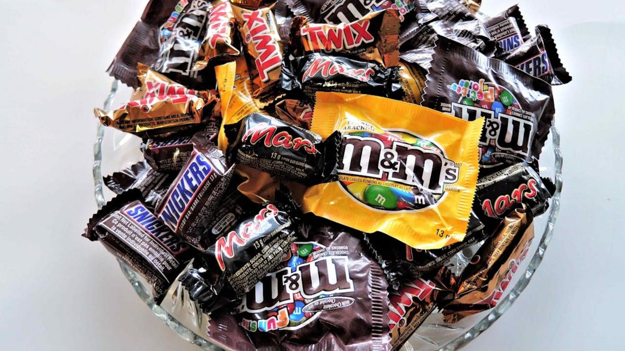
Hey there! I’ve noticed something sneaky during my regular grocery shopping trips – those tempting multi-packs always catch my eye right when I need just one item. The stores know exactly what they’re doing by placing these bulk options front and center, making you think “what a great deal!” even if you don’t need that much. They’ll put the single items on a lower shelf or tucked away, pushing you toward buying more than what’s on your list.
Here’s the thing – while multi-packs can save money for items you regularly use, they often lead to overbuying perishables that might go bad before you finish them. I’ve fallen into this trap countless times with yogurt multi-packs. The store displays make the per-unit price look so attractive compared to buying singles, but if half the pack spoils, you’ve actually spent more money and wasted food. Next time you shop, take a moment to consider if you’ll really use everything in that multi-pack before grabbing it off the shelf.
Misleading Serving Size Suggestions
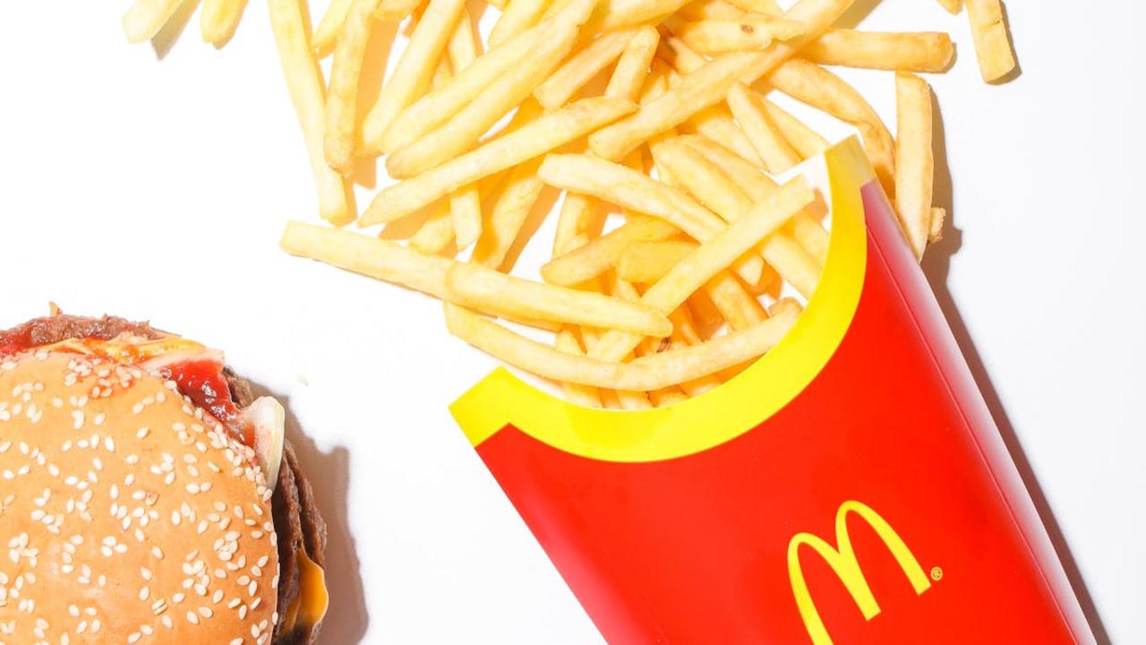
Have you noticed how many cereal boxes show tiny portions in their serving size photos? Those perfectly arranged bowls with just a few spoonfuls can make you think you’re eating a reasonable amount, while you actually pour two or three times more into your bowl. Food companies know exactly what they’re doing – they want their products to appear lower in calories and more nutritious by basing nutrition facts on unrealistic portions that nobody actually eats. This clever tactic helps them market their products as “healthy choices” while most people end up consuming far more than the suggested amount.
I recently caught myself pouring what I thought was a normal bowl of granola, only to measure it and discover I was eating nearly three servings! The suggested portion on the box was a mere 1/4 cup, which looked more like a snack than breakfast. These misleading serving sizes appear on everything from chips to ice cream, making you think you’re getting more value for your money. The truth is, you’ll go through the package much faster than expected, leading you back to the store to buy more. Next time you shop, take a close look at those serving suggestions and compare them to what you actually eat – you might be surprised by the difference!
Illusion of Bulk through Size Variation

You’ve probably noticed how some grocery stores mix different package sizes of the same product on the shelf. This clever arrangement makes the larger packages look like a much better value, even when they’re not. For example, you’ll see a 12-pack of yogurt cups next to single-serve options, making the multi-pack appear more attractive and economical. The stark size difference triggers your brain to automatically assume the bigger option saves you money, leading you to grab it without checking the actual price per unit.
Next time you shop, take a closer look at how stores arrange similar items in varying sizes. That massive box of cereal might catch your eye when it’s placed next to the standard size, but remember to check the unit price label (usually in small print on the shelf tag). I’ve caught myself falling for this trick many times before learning to do the math. The bigger package doesn’t always mean better value – sometimes the smaller option costs less per ounce, and you’ll avoid potential food waste from buying more than you need.