10 Ways Sneaky Food Packaging Nudges You to Toss More in Your Cart
Ever notice how your shopping cart fills up faster than your stomach could possibly keep up? Food companies spend millions designing packaging that tricks you into buying more than you need. From oversized boxes with minimal contents to cleverly worded health claims, these tactics work directly on your subconscious while you shop.
Your brain makes quick decisions in the grocery aisle based on visual cues and emotional triggers. That “family size” might seem like a bargain until you realize the actual cost per ounce, or that “made with real fruit” product contains just a tiny percentage of actual fruit. These psychological nudges add up to real money out of your pocket.
I started tracking these packaging tricks after finding myself constantly overspending at the store. Understanding these marketing tactics helps you shop more intentionally and stick to your budget. Ready to spot the sneaky ways food packaging manipulates you into buying more? Let’s pull back the curtain on these common industry tricks.
Packaging Shape that Implies Innovation

You know that sleek triangular pasta box that catches your eye in the grocery aisle? Or those uniquely curved yogurt containers that look like they belong in a modern art gallery? Food companies spend millions designing packaging shapes that scream “innovation” and “premium quality” – and honestly, it works on me more often than I’d like to admit. These unconventional shapes create an instant perception that the product inside must be somehow better, more advanced, or worth the extra cost compared to traditional rectangular boxes or cylindrical containers.
I’ve learned to pause and really examine what I’m buying when I spot these design-forward packages. That geometric cereal box might contain the same processed ingredients as the boring rectangular one next to it, but you’ll pay 30% more for the “innovative” packaging. Instead of getting swayed by clever shapes, I focus on reading ingredient lists and nutritional information. The truth is, the most nourishing foods – fresh vegetables, whole grains, legumes – often come in the simplest packaging or no packaging at all. Save your money for quality ingredients rather than fancy containers that end up in the recycling bin anyway.
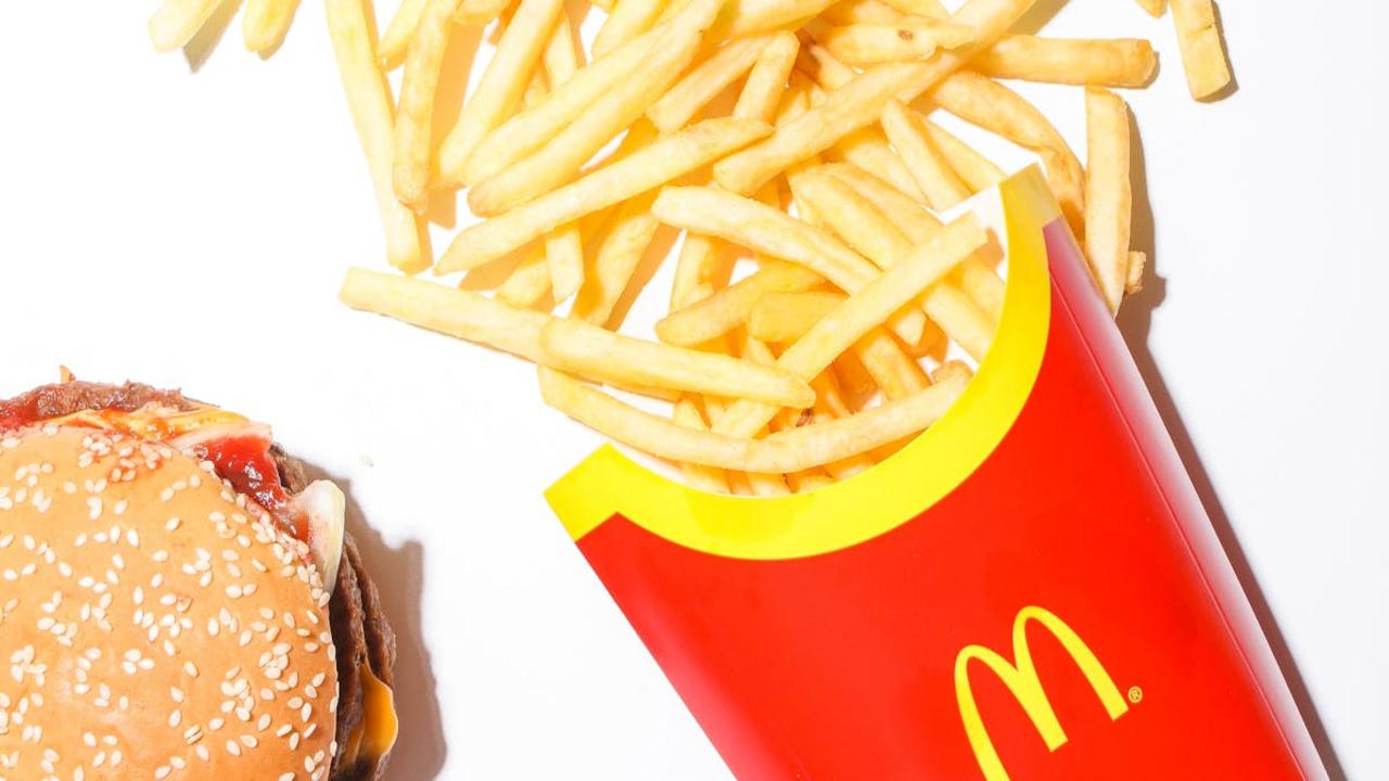
Use of Emotive Colors to Stimulate Appetite

You know that rush you get walking down the snack aisle? Those bright reds and warm oranges aren’t accidents – they’re carefully chosen to make your stomach growl and your hand reach for that bag of chips. Food companies spend millions studying how colors affect our brains, and red particularly triggers hunger signals while yellow creates feelings of happiness and comfort. Think about McDonald’s golden arches or Coca-Cola’s signature red – these colors literally make us crave food before we even taste it.
I’ve noticed this pattern everywhere during my grocery shopping adventures, from the fiery orange of Cheetos to the deep red of tomato sauce cans. What fascinates me is how these same companies often use cooler blues and greens for their “healthy” product lines, knowing these colors suggest freshness and natural goodness. Next time you shop, try this experiment: compare the packaging colors in the processed food aisles versus the organic section. You’ll spot the psychological manipulation immediately, and it might just help you make more mindful choices for your kitchen and your family’s wellbeing.
Perceived Value through Price Anchoring
You know that feeling when you walk down the grocery aisle and suddenly a $12 jar of pasta sauce seems reasonable because it’s sitting right next to the $18 “premium artisanal” option? That’s price anchoring in action, and food companies have mastered this psychological trick. They strategically place their most expensive products at eye level, making everything else appear more affordable by comparison. I’ve watched my own shopping habits shift when I see that $25 bottle of olive oil prominently displayed – suddenly the $15 bottle feels like a smart middle-ground choice, even though I originally planned to spend $8.
This sneaky strategy works because our brains naturally use the first price we see as a reference point for all other decisions. Food manufacturers know this, so they create product lines with intentionally high-priced “decoy” items that exist purely to make their mid-range products seem like better deals. When I’m developing recipes at home, I’ve learned to resist these anchoring tricks by focusing on ingredient quality rather than packaging promises. That $8 olive oil often comes from the same region as the $25 bottle – the difference lies in marketing, not flavor. I always check the actual origin and processing methods listed in small print rather than getting swept up in the price theater happening on the shelves.
Employing Limited Edition Branding

You know that feeling when you spot a “limited edition” label on your favorite snack? Your brain immediately shifts into scarcity mode, whispering that you better grab it now before it disappears forever. Food companies understand this psychology perfectly, creating artificial urgency around products that might otherwise sit peacefully on shelves. They’ll slap seasonal flavors on everything from cookies to cereals, knowing we’ll reach for that pumpkin spice version even when we have three boxes of the regular flavor at home. This marketing tactic transforms routine grocery shopping into a treasure hunt, making us feel like we’re collecting rare finds rather than buying mass-produced items.
I’ve watched this play out in my own kitchen countless times – suddenly I have five different “limited time” pasta sauces taking up precious pantry space because I couldn’t resist their special appeal. The truth is, most of these products return annually or get rebranded with slight variations, but that scarcity messaging works like magic on our decision-making process. Instead of falling for these tricks, I focus on building my pantry with versatile, whole ingredients that let me create my own “limited editions” at home. When I want that seasonal pumpkin flavor, I add real pumpkin puree and warm spices to my homemade dishes – creating something truly special without the marketing manipulation.
Clever Use of Recyclable and Eco-Friendly Claims

You know how good it feels when you spot that green leaf symbol or “100% recyclable” badge on packaging? Food companies absolutely know this too, and they’re using your environmental consciousness to fill their pockets. I see this constantly when I’m shopping for ingredients – products with minimal actual eco-benefits plastered with feel-good green messaging. That pasta sauce might come in a “recyclable” jar, but the company conveniently doesn’t mention their massive carbon footprint from shipping or their questionable sourcing practices. The psychological trick works because you feel like you’re making a responsible choice, so you’re more likely to grab that item over others.
Here’s what really gets me fired up: many of these “eco-friendly” claims are either misleading or completely meaningless. Take those snack packages boasting “made with recycled materials” – they might contain 2% recycled content while the rest is virgin plastic that’ll sit in landfills for centuries. I’ve learned to look beyond the green washing and focus on what actually matters. Instead of falling for these marketing tricks, I choose products with genuinely minimal packaging, buy from local producers when possible, and make more things from scratch. Your homemade granola bars don’t need any packaging at all, and they taste infinitely better than anything wrapped in fake environmental promises.
Visually Deceptive Font and Imagery

You know that moment when you’re scanning the cereal aisle and suddenly find yourself drawn to a box that screams “WHOLE GRAIN” in bold, earthy letters? Meanwhile, tucked away in tiny print at the bottom, you discover it contains more sugar than actual grains. Food companies master this visual sleight of hand, using large, health-focused fonts to highlight their best attributes while burying the not-so-great ingredients in microscopic text. They’ll splash vibrant images of fresh strawberries across a package that contains artificial strawberry flavoring and maybe one percent real fruit. This deliberate misdirection works because our brains process visual information faster than we can read every single ingredient.
I’ve learned to flip packages around and ignore the front-of-package marketing completely when I’m shopping for my family. Those beautiful photos of farm-fresh vegetables on processed soup cans? Pure theater. The real story lives in that ingredient list on the back, where you’ll often find more preservatives than actual vegetables. Instead of falling for these visual tricks, I focus on products with short, recognizable ingredient lists – or better yet, I head straight to the produce section where the packaging tells the honest truth. When you cook from scratch with real ingredients, you never have to decode misleading fonts or question whether that gorgeous imagery matches what’s actually inside the package.
Using Scientific Language for Health Halo
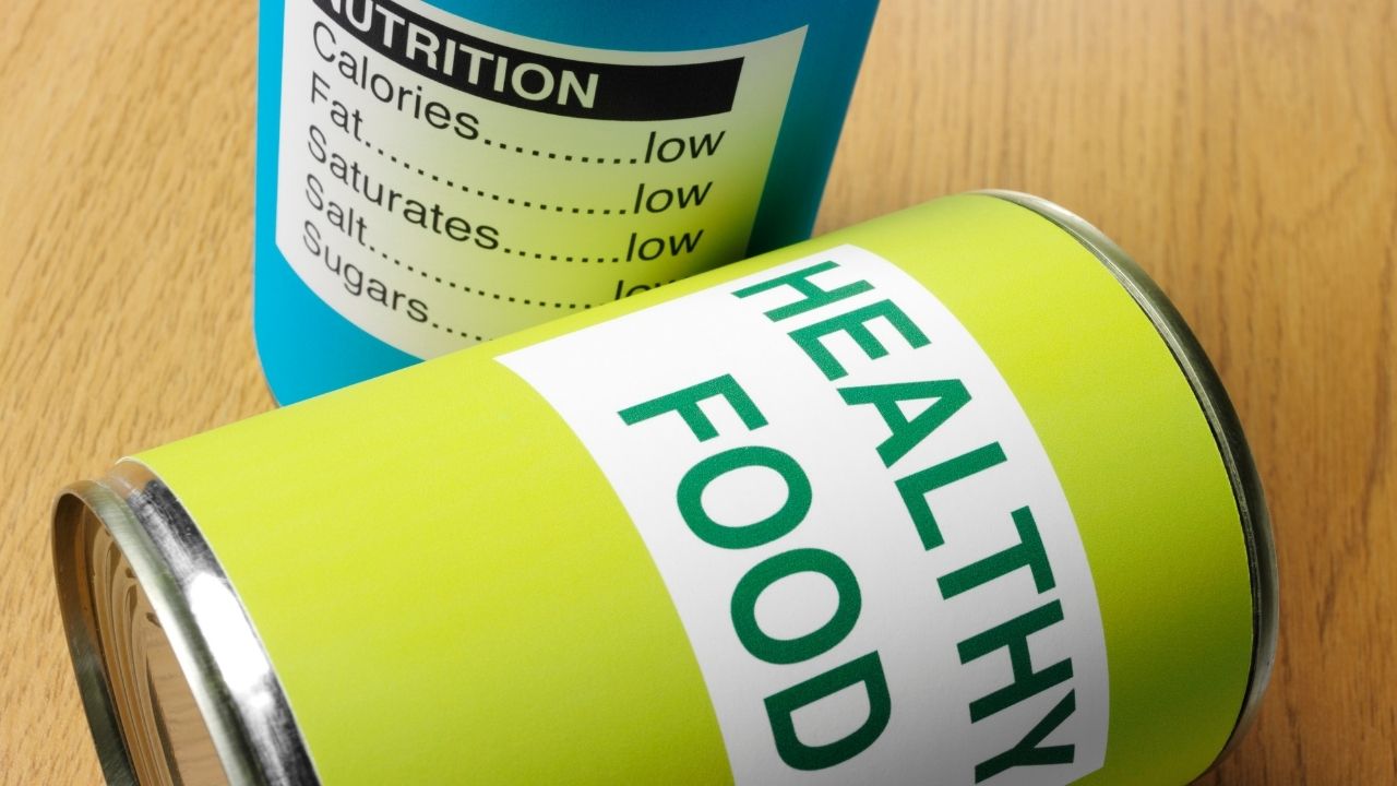
You know what really gets me fired up when I’m walking through the grocery aisles? Those fancy packages covered in scientific jargon that make processed foods sound like they belong in a laboratory instead of your pantry. Words like “clinically proven,” “bioavailable nutrients,” and “antioxidant complex” get splashed across everything from breakfast cereals to energy bars. Companies know we want to make healthy choices for our families, so they dress up their products in this pseudo-scientific language that makes us feel smart and health-conscious for picking them up.
Here’s the thing that bothers me most about this trickery – real nutrition doesn’t need complicated explanations. When I’m cooking with fresh turmeric, I don’t need a package telling me about its “curcumin bioactivity profile.” I just know it adds warmth, color, and goodness to my curries and golden milk. These scientific-sounding terms create what marketers call a “health halo” – basically making you think something processed and packaged is somehow superior to whole foods. Next time you see phrases like “enhanced with prebiotics” or “fortified with essential amino acids,” ask yourself if you could get the same benefits from actual food instead of something manufactured in a factory.
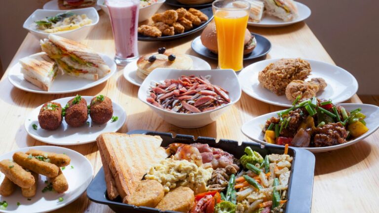
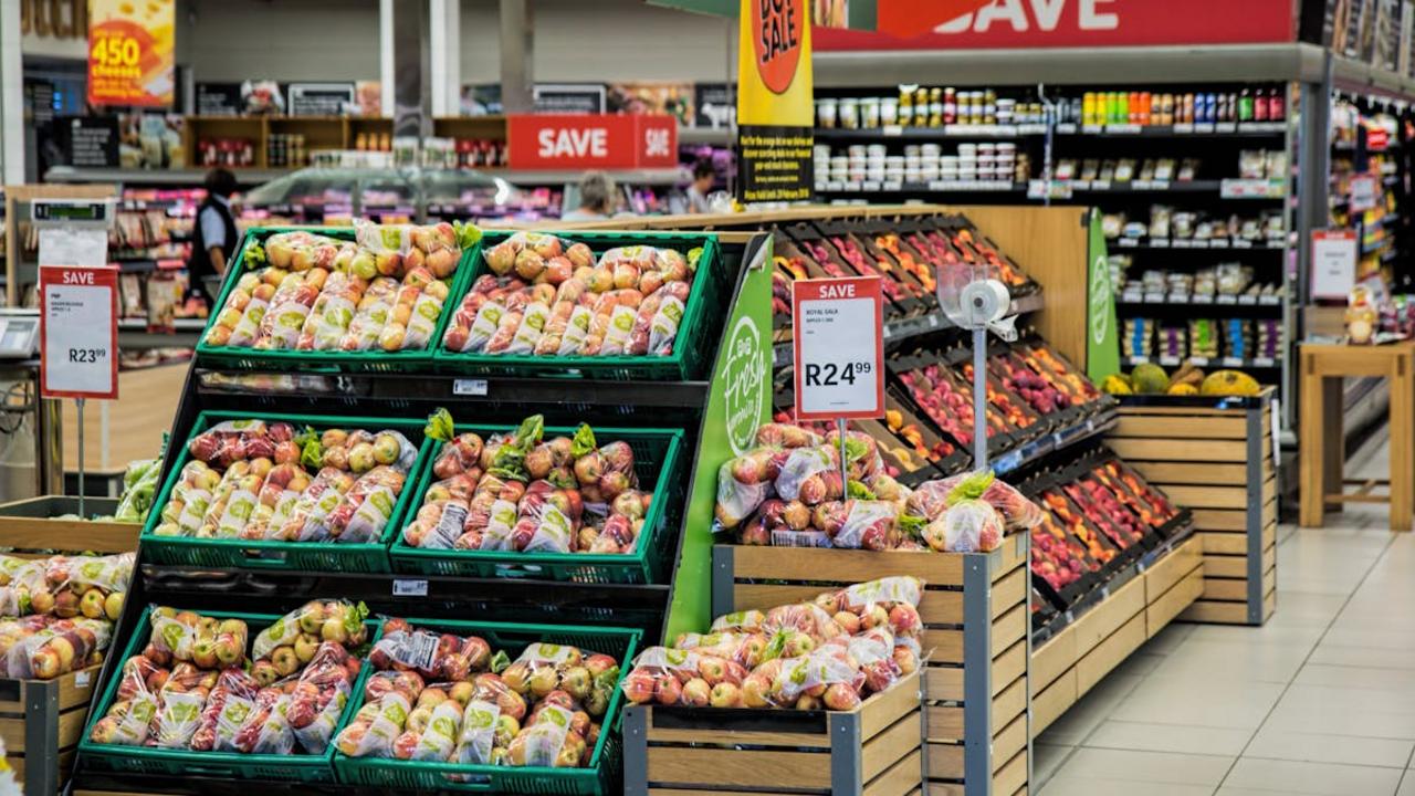
Strategic Placement of Multi-Packs
You know that feeling when you walk into the grocery store for just a few items, and somehow end up with three family-size boxes of crackers? That’s no accident, my friend. Retailers position multi-packs at eye level and in high-traffic areas because they understand something fundamental about how we shop: we see bulk and immediately think “value.” Those towering displays of triple-wrapped granola bars or six-packs of yogurt cups practically scream savings, even when the per-unit cost tells a different story. I’ve caught myself reaching for these bundles countless times, convinced I’m being smart with my budget.
Here’s what really gets me about this strategy – it pulls us away from buying exactly what we need. When I started paying attention to my shopping patterns, I realized these multi-packs often led me to stock up on processed snacks instead of investing in fresh ingredients that could create multiple wholesome meals. Now I make a point to calculate the actual cost per unit and ask myself: do I really need six containers of flavored yogurt, or would I be better off with plain yogurt and fresh berries to create my own combinations? This simple shift has helped me stay focused on real food while actually saving money. The key is recognizing these displays for what they are – calculated moves to increase your cart total, not necessarily your nutritional value.
Misleading Serving Size Suggestions
You grab a bag of nuts thinking you’re making a healthy choice, then flip it over to check the nutrition facts. The package cheerfully declares “150 calories per serving” – sounds reasonable, right? But here’s where food manufacturers get sneaky: they’ve decided that one serving equals just 14 almonds or a measly quarter cup. Who stops at 14 almonds? I certainly don’t, and I bet you don’t either. These ridiculously small serving sizes make products appear far healthier and lower in calories than they actually are when you consume a normal portion.
I’ve learned to ignore those suggested serving sizes completely and focus on what I actually eat. When I’m cooking at home, I measure ingredients based on what feels satisfying and nourishing, not what some marketing team decided looks good on a label. That “single serving” bag of trail mix? It’s probably meant for two or three people according to the fine print. The same trick applies to cereals, crackers, and even beverages – they’ll split a 20-ounce bottle into 2.5 servings to make the sugar content look more acceptable. Always multiply those nutrition numbers by how much you’ll realistically consume, and you’ll get a true picture of what you’re putting into your body.
Illusion of Bulk through Size Variation

You know that moment when you’re standing in the cereal aisle, comparing two boxes that look nearly identical in size, only to discover one contains 12 ounces while the other holds 16? Food manufacturers have mastered this sneaky trick, creating packages that appear similar in volume but contain vastly different amounts of product. They’ll make a box taller but narrower, or wider but flatter, maintaining that visual impression of bulk while secretly reducing the actual contents. This sleight of hand particularly gets me when I’m shopping for pantry staples like rice, quinoa, or my favorite whole grain pasta – ingredients I rely on for creating those nourishing, from-scratch meals that keep my family satisfied.
The psychology behind this packaging deception runs deep, playing on our natural tendency to judge quantity by visual cues rather than reading every single label. When you’re meal planning and trying to stock up on wholesome ingredients, these size variations can throw off your entire grocery budget and leave you short on supplies mid-week. I’ve learned to always check the net weight or volume printed on packages, especially when buying bulk items like oats, lentils, or nuts that form the foundation of my healthy cooking approach. Trust me, once you start paying attention to actual quantities rather than package appearance, you’ll save money and avoid those frustrating moments when your “large” container of tahini runs out halfway through your Mediterranean-inspired dinner prep.